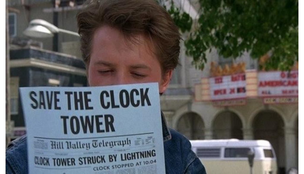
Meet me at the clock (at Glenn Square).
Town Centers and minimal effort aesthetic design standards.
The Town Center concept is often pitched to planning and zoning boards to make their project more appealing and likely to be approved. Artist renderings usually show the mall on a sunny day with people strolling the promenade in front of Famous Footwear while a young mother reads a book on the bench with her baby buggy beside her. Here’s a sample description of the Town Center from a city planning document:
PURPOSE: The purposes of the Town Center (TC) Zone are to: allow
businesses, within a planned and architecturally unified development, which
provide convenience goods and services to a work population and the
residences of adjacent neighborhoods; allow developments which will link the
older residential areas of the city, city parks, and municipal buildings, via
pedestrian, bicycle, and vehicular access; allow development at a small scale
with a town – like setting; and supplement or serve adjacent areas without having
an adverse impact on adjacent areas; but always with the intention of furthering
the public health, safety, and general welfare
When you visit Glenn Square in Northeast Anchorage, do you feel like you’re in a town-like setting? Maybe not, but can we do better?
Project Background
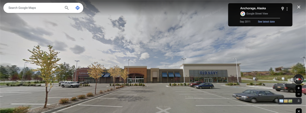
Glenn Square was not a homerun project from the start. It involved a series of land swaps with various government and non-profit organizations, wetland permitting, and rezoning of 35 acres. The project was developed by P O’B Montgomery & Co., a national real estate company that develops neighborhood shopping centers. It has since been transferred to FTC Property Management and JL Properties JV.
The project is described as a mixed-use commercial/residential development.
AO 2006-43
However, a residential component is not planned for the first phase and it is
uncertain when a mixed-use development will be provided. A special limitation is
recommended to ensure residential development is included in the next phase of the
development. This should be a minimum of 12 dwellings units per acre as allowed
in the B-3 zoning district.
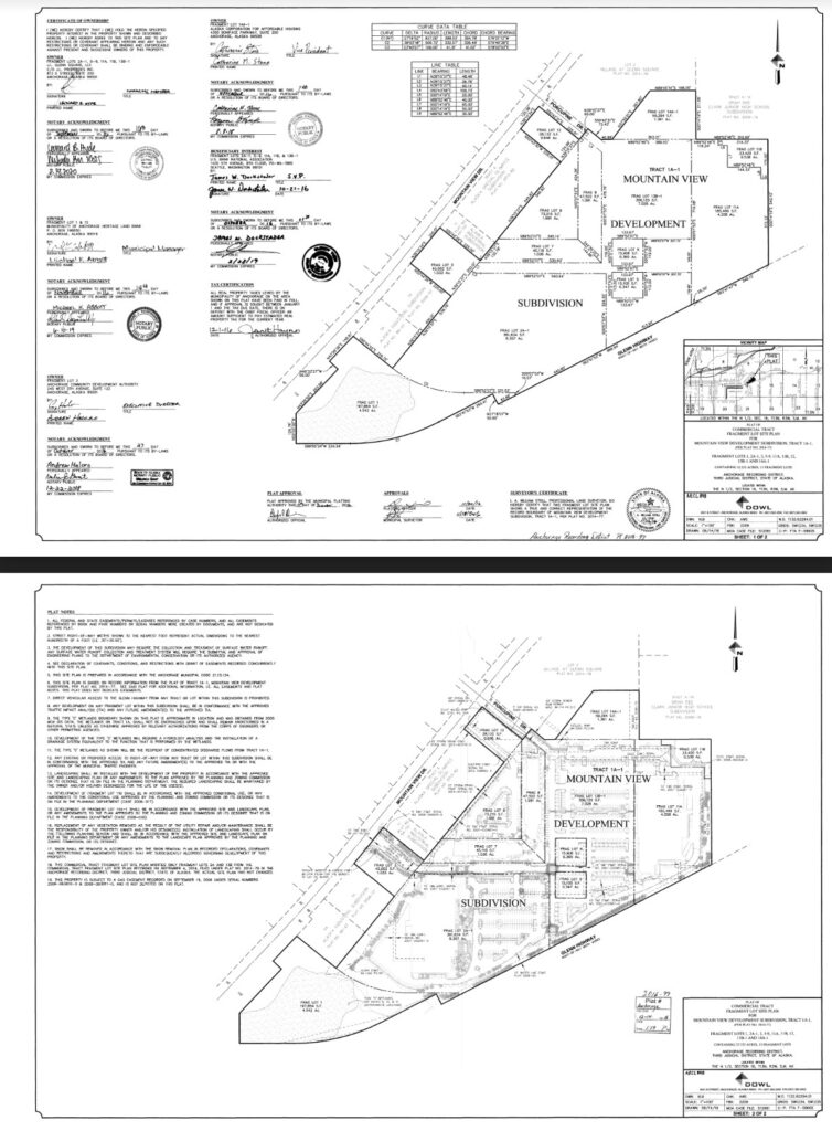
Yes, this was billed as a mixed-use development, including residential, which is partially true. AHFC’s Ridgeline Terrace apartments are platted as Village at Glenn Square; there is also a fragment lot on the North end of the property owned by AHFC. It’s unclear whether the original developer had planned residential or office space within the mall complex.
Seemingly Arbitrary Design Standards
While it seems that so many of these developments feign interest in aesthetics or make a half-hearted attempt at building a place people want to visit, it’s mostly a result of design standards that force them to apply the bare minimum of aesthetic value to have their project greenlit. Even more frustrating is when the developers almost make something an asset to the community but fall short, having only met the minimum design standards. For example, there may be a stipulation on the number of trees in a parking lot but no requirement for suitable growing conditions or, making a place where people could theoretically congregate and relax but would never want to.
To be clear, I am not advocating against design standards but instead rules that apply an arbitrary set of rules to a development that only makes it look slightly less like what it is, in this case, a car-oriented shopping center.
Here’s an example from the building code at the time of Glenn Square’s permitting/construction:
Community spaces. Appropriate interior and exterior public areas shall be provided and maintained for customers and visitors to the site to congregate and relax
This development is very close to being almost what it promised, so I’d like to discuss ways this property could live up to the promise of being a “town center.” It’s also not entirely up to the developer to make sure the project is well-integrated and accessible; some of that can be done through public works.
Better integration with the community
The proposed development is part of the effort to revitalize the commercial core area of Mountain View as envisioned by the community and summarized in the 1998 report for Mountain View Drive – A Vision for the Future. The mission statement of the report affirmed the desire that “Mountain View Drive will become the showcase of an ethnically diverse community, a main street that is aesthetically pleasing, with appropriate landscaping, pedestrian-friendly orientation that accommodates winter, and remains supported by strong zoning and code enforcement.”
Planning and Zoning Commission Resolution 2005-078
Can Glenn Square be an asset to the community?
Yes, I think it could.
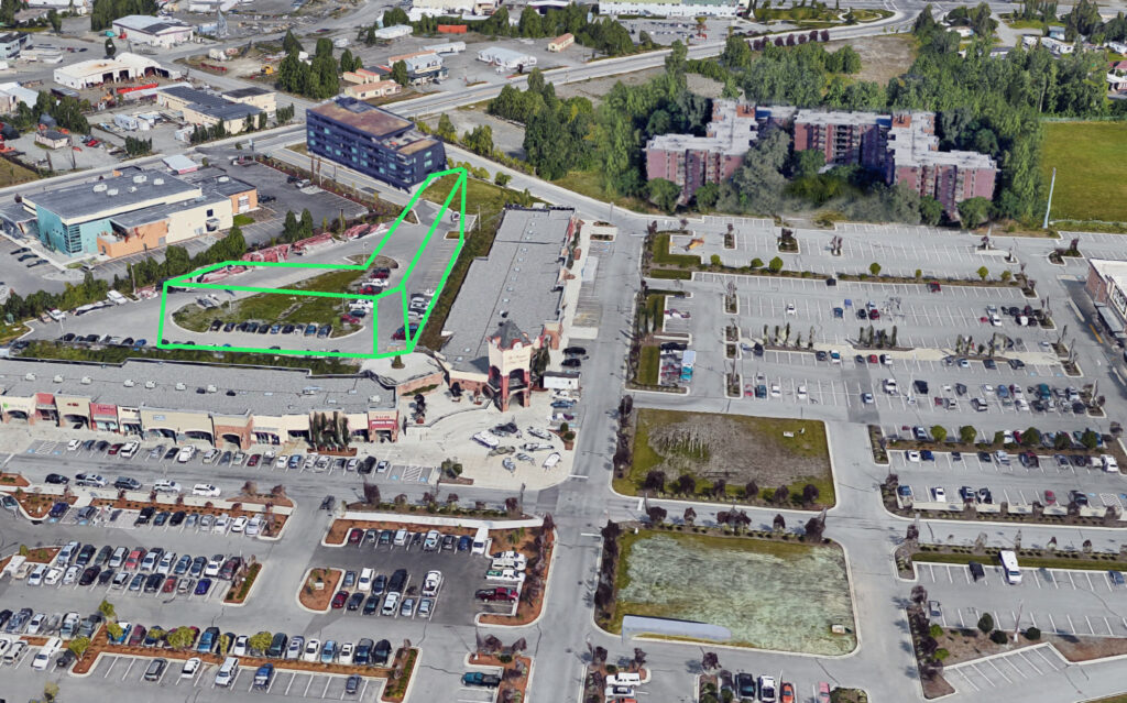
Unlike Tikhatnu Commons, Glenn Square is close to where people live, and it could be better integrated with the surrounding community with some pedestrian infrastructure as illustrated below:
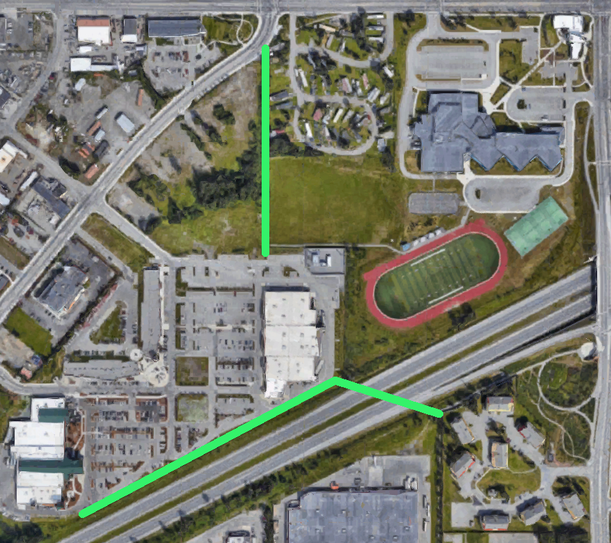
A walking path on the North side of the property could connect with Mountainview Drive. Even though the sidewalks on Mountain View Drive are more walkable than most in Anchorage, the curvature of the road and entry via Porcupine Drive adds over 800 feet of walking round trip. To an elderly or disabled person, that’s significant, especially in the wintertime. Additionally, if the trailer park is eventually redeveloped, the walking path could be integral to the design of the new housing area.
A more complex but significant connection would be a tunnel connecting the walking path across the highway to the South and along the South side of the mall property.
Better amenities
The mall does provide some valuable local shopping options, employment, and affordable dining options, but it would better serve the community with the following additions:
Bus Stop
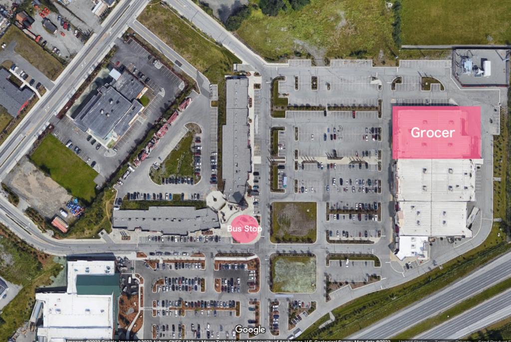
A simple signpost sticking out of a snowbank will not do. – the property owners must invest in an all-weather, heated bus shelter or small building to serve as a bus station with indoor seating. It’s important to consider that many people who work in retail and food service struggle to afford a personal vehicle, so using public transit should be convenient and not another hardship. It could even be aesthetically pleasing.
Grocery
Because Party City seems to be the least essential of the large retail spaces on-site, I’d recommend that location for a new grocery store. However, there seem to be plenty of underutilized parking areas that could be developed.
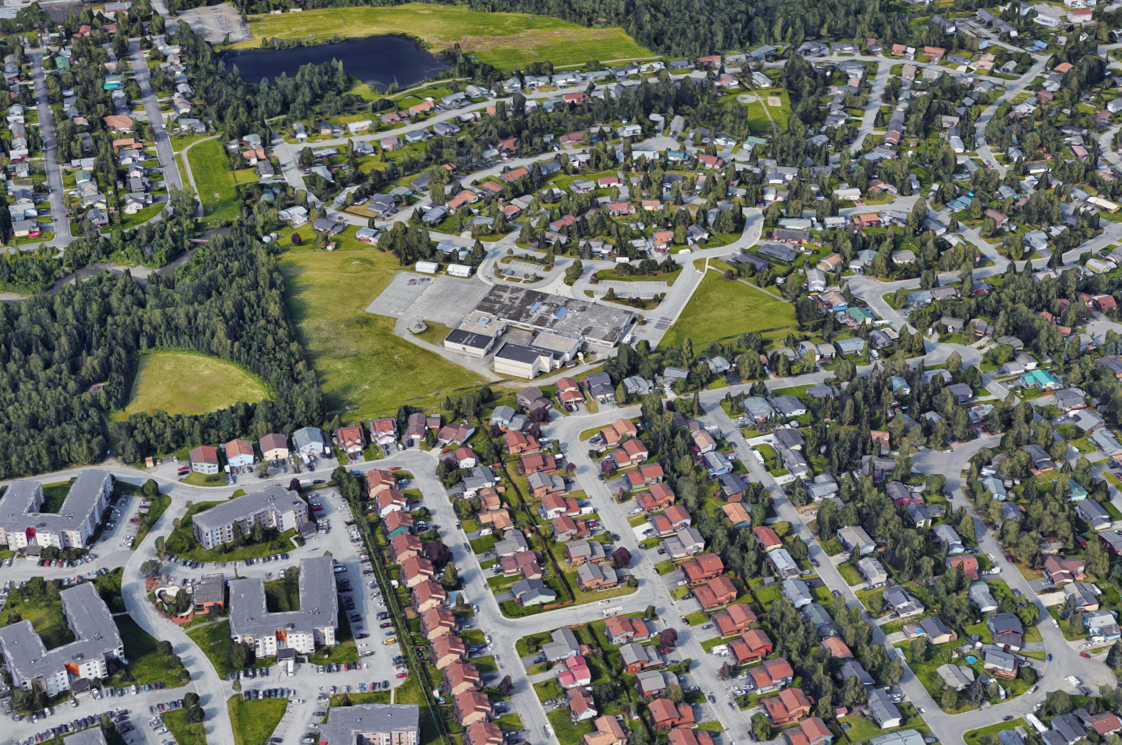
** It is important to note that the Google satellite view of Glenn Square appears to have been imaged during Bass Pro Shop’s grand opening. The parking lot is particularly full, including the upper lot and boats on display in the common area.**
The Clock Tower and “La Terrazza del Glenn”
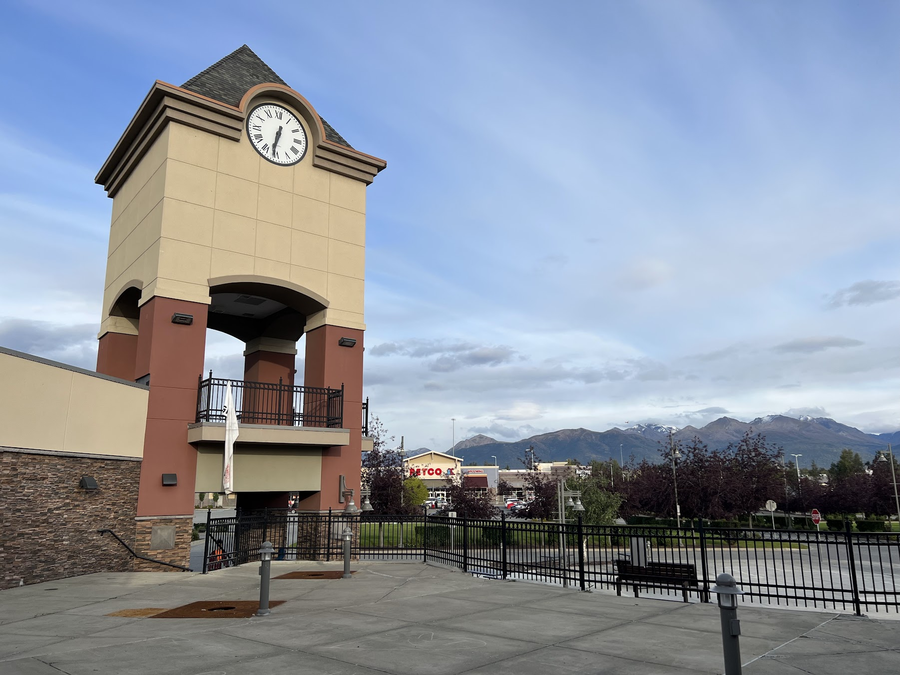
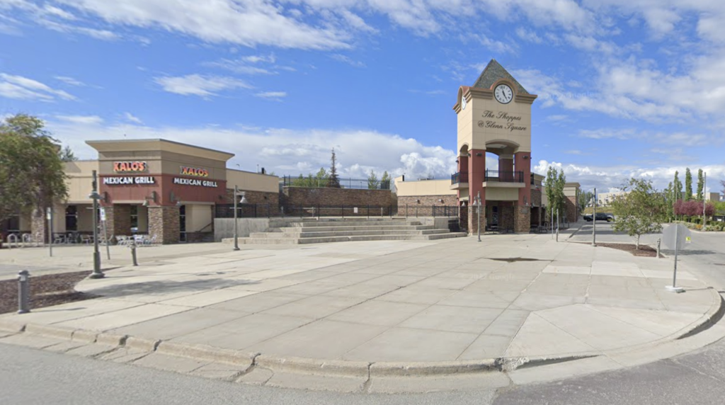
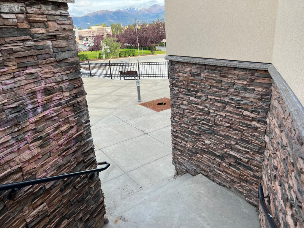
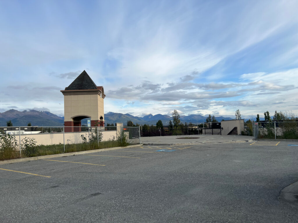
The centerpiece of the fake town center of Glenn Square is the clock tower and surrounding terrace plaza. The clock is functional but completely dysfunctional otherwise, especially the balcony below it, which is not physically accessible.
The area surrounding the clock tower, which I’m referring to as La Terrazza del Glenn (a nod to shopping centers with signage that says things like “The Shoppes”), feels almost like a movie set or prop meant to give the illusion of a public place without any substance, which exists for no real purpose.
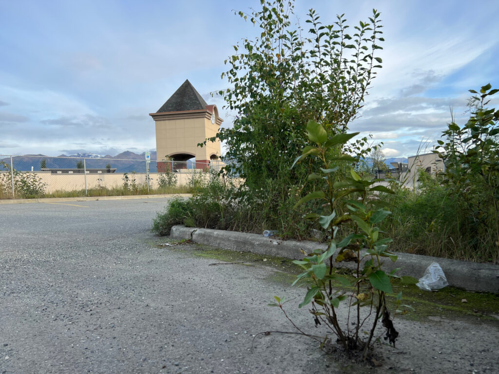
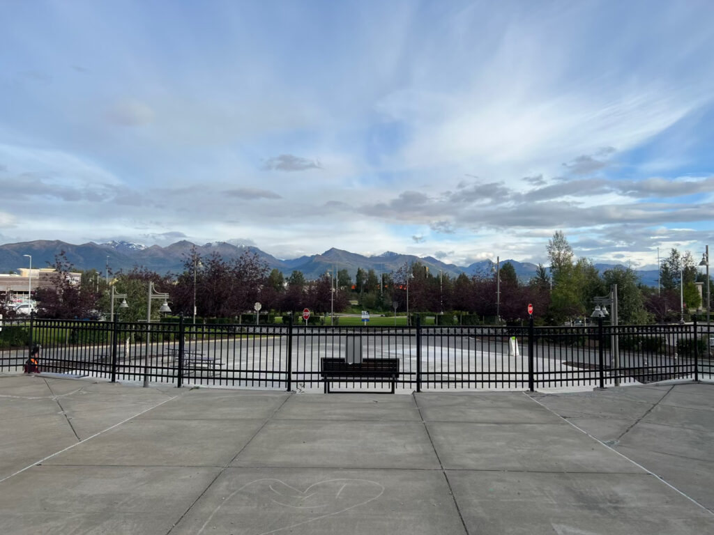
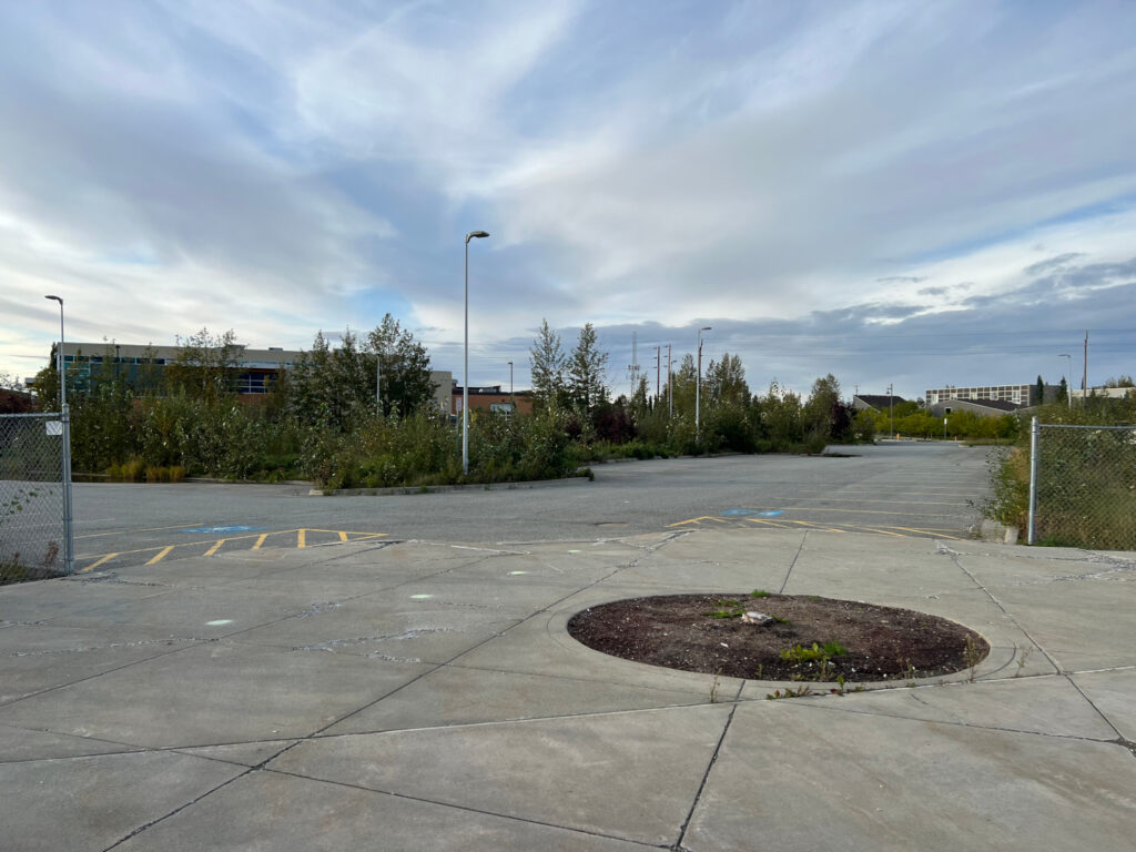
Glenn Square (almost) made a place for visitors to “congregate and relax” but an entirely artificial and dead space with no real integration to the site other than stairs, which lead to an overgrown parking lot. The spaces on either side could have easily had doors and windows connected to the exterior public area, but they decided against it for some reason. However, this could be rectified with some renovations or tenant improvement funding.
Could this be a place worth visiting?
Yes, I think it could. Imagine a mixed-use building in this lot, maybe a restaurant with a terrace integrated with the Glenn Square stairs. The upper levels of the building would have a very nice view of the Chugach Mountains. The “Terraza” could be spruced up with string lights and integrated with the abutting restaurant spaces. I’d love to enjoy a taco from Xalos out on the Terraza on a warm summer evening.
