Project ’20s kicks up dust from Project ’80s – Two
intrinsic.city reflects on Anchorage’s single largest civil construction project – Part 2 of 4
Alaska Center for the Performing Arts – The PAC
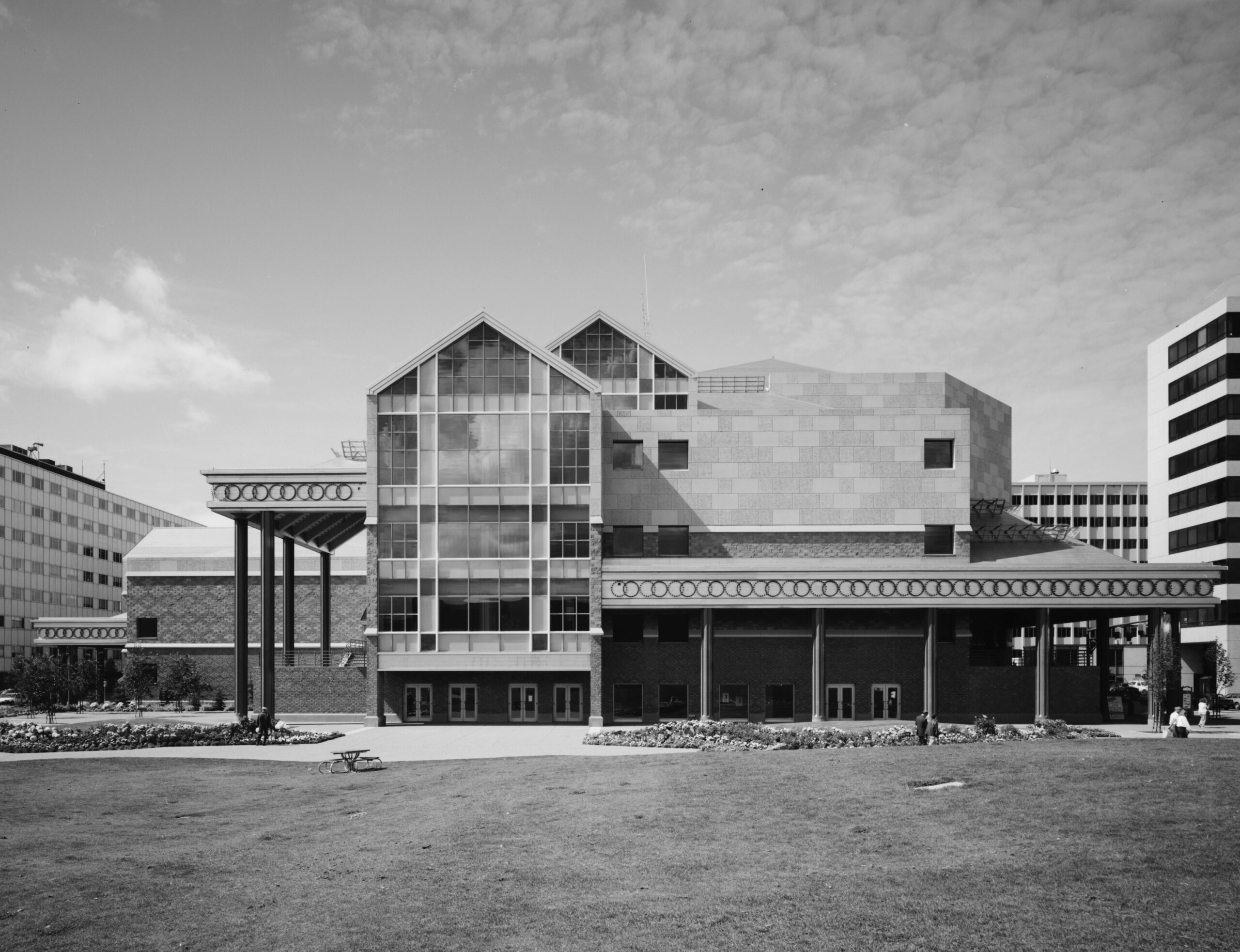
What could be called the most controversial of the Project ’80s buildings, construction of the Alaska Center for the Performing Arts or simply the PAC required the demolition of (over) an entire city block of municipal buildings which included the PAC’s direct predecessor – The Sidney Laurence Municipal Auditorium. The auditorium, also designed by Manley & Mayer (in 1953), was a utilitarian structure that was severely undersized for an aspiring metropolis like Anchorage. Additionally, the block was occupied by Anchorage’s first high school and the art deco style Anchorage Central Grade School which was built in 1939 as a New Deal project under president Roosevelt. What role these buildings would play in a 21st-century city (if they had been preserved) is anyone’s guess but they are a prime example of Anchorage’s tendency to tread water in regard to growing the footprint of our urban core.
The significant overrun in construction costs from the original estimate of $45M added to the controversy surrounding the project; the plan for the center was was convoluted from the start. Shortly after becoming mayor, Tony Knowles fired the original architects and hired the New York- Los Angeles firm Hardy Holzman Pfeiffer Associates who were tasked with changing the design from four separate theaters to one massive facility. While the increased cost was of no consequence to Anchorage, the PAC was completed in 1988 at a final price tag of $70M and in the midst of the state’s economic crisis. Operating costs were hotly debated to the point which mayor Tom Fink threatened to veto funding and mothball the building despite the immediate popularity and high profile bookings including Jay Leno, Diane Schuur, and Count Basie Orchestra.
The Center’s flashing ring light installation was commissioned from New York artist and “sculptor of light”, Eric Staller. In 1985, his famous LIGHTMOBILE, a VW Beetle covered in 1,659 computer-controlled flashing lights toured the world to the delight of millions. There too was controversy over his light installation on the PAC.
The building was widely criticized for the lack of a safe drop-off zone for patrons, particularly those with disabilities – a problem that persists today. In fact, this was addressed in the Anchorage Town Square Master Plan, published in 2019. The redesign plan for the park takes note of the issue while also dismisses it by citing the difficulty of the required traffic changes and pointing out that the PAC is a separate entity and therefore not obligated to be included in the park plan.
Why the boring name? You’ve probably noticed the PAC is the only municipal building that is not named after a person and there’s a reason for that, unfortunately. When the project was approved, the Anchorage Assembly voted to name the facility after Dr. Martin Luther King, Jr. but a voter-led initiative overturned that decision, by a wide margin. In 1990, the population of Anchorage (210,000) was 80.7% white and only 6.4% black / African American – regardless of the fact that King never visited Anchorage or any involvement in the widely publicized decision to rescind the designation likely reflected negatively on Anchorage.
Finally, Anchorage’s own municipal sign ordinance prohibits the PAC from having a proper marquee, a necessity for any theater. An attractive, lighted sign would greatly improve the aesthetics of the building, particularly if placed on the North (5th Ave) side of the building on the massive, bare concrete wall that towers over the street.


No SIGN is needed. No it would not ADD to the aesthetics of the place. How you think a sign would add positively to a buildings looks defies intelligence. Additionally, by your own reporting, it would violate the sign ordinance.
You’re right, the 60ft high bare concrete wall looks much better, you should consider a career in design when you’re not busy posting angry comments on articles. Interesting that you didn’t pick up on the suggestion to change the ordinance and allow the sign.
You missed the entire reason I commented, which was because I did see you were tap dancing around at minimum getting a variance, or maybe even changing the sign ordinance. Either of which is wrong. One tall concrete wall is no reason to change and start tossing up billboards, and yes, that’s what I read in your article. Not every place, every town, needs to brr designed by self declared artisans. And to boot, you want to create a sales tax on top of it all. You’re just full of joy…
Hi there, if you’d like to pitch a story, I’d be happy to consider posting it. Use the contact form to tell me about your article or send one for review. Thanks for reading!